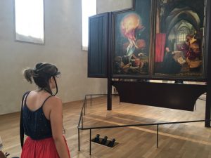
This article aims to reveal aspects of the visual perception of the natural colours of Matthias Grünewald’s Resurrection panel, part of the Isenheim Altarpiece (1512‐1516). To identify, which colours are mostly perceived, we have performed an eye‐tracking study with 52 participants at the Unterlinden Museum, in Colmar, France, in which we recorded the participant’s eye movements and their spontaneous comments when looking at Grünewald’s work, using an innovative approach to let visitors be free while recording their gaze in a realistic observation condition. Results indicate that although orange and red colours are perceived faster, yellows and browns are focused for a more extended period and visited more frequently. The Resurrection‘s colours are perceived by participants as containing strong emotional content, being explicitly crucial for the full understanding of the painting. Yellow remains the most salient colour of the artwork for the observers, and it is associated with light and transcendent content.
https://doi.org/10.1002/col.22641